


CLIENT
LENWICH
CATEGORY
Event & Space
Event & Space 렌위치 역삼점 리뉴얼
본문
강남 GFC 지하몰에 위치한 LENWICH 역삼점의 공간 및 그래픽 디자인 리뉴얼을 진행했습니다.
We carried out the spatial and graphic renewal design for LENWICH Yeoksam, located in the underground mall of GFC.
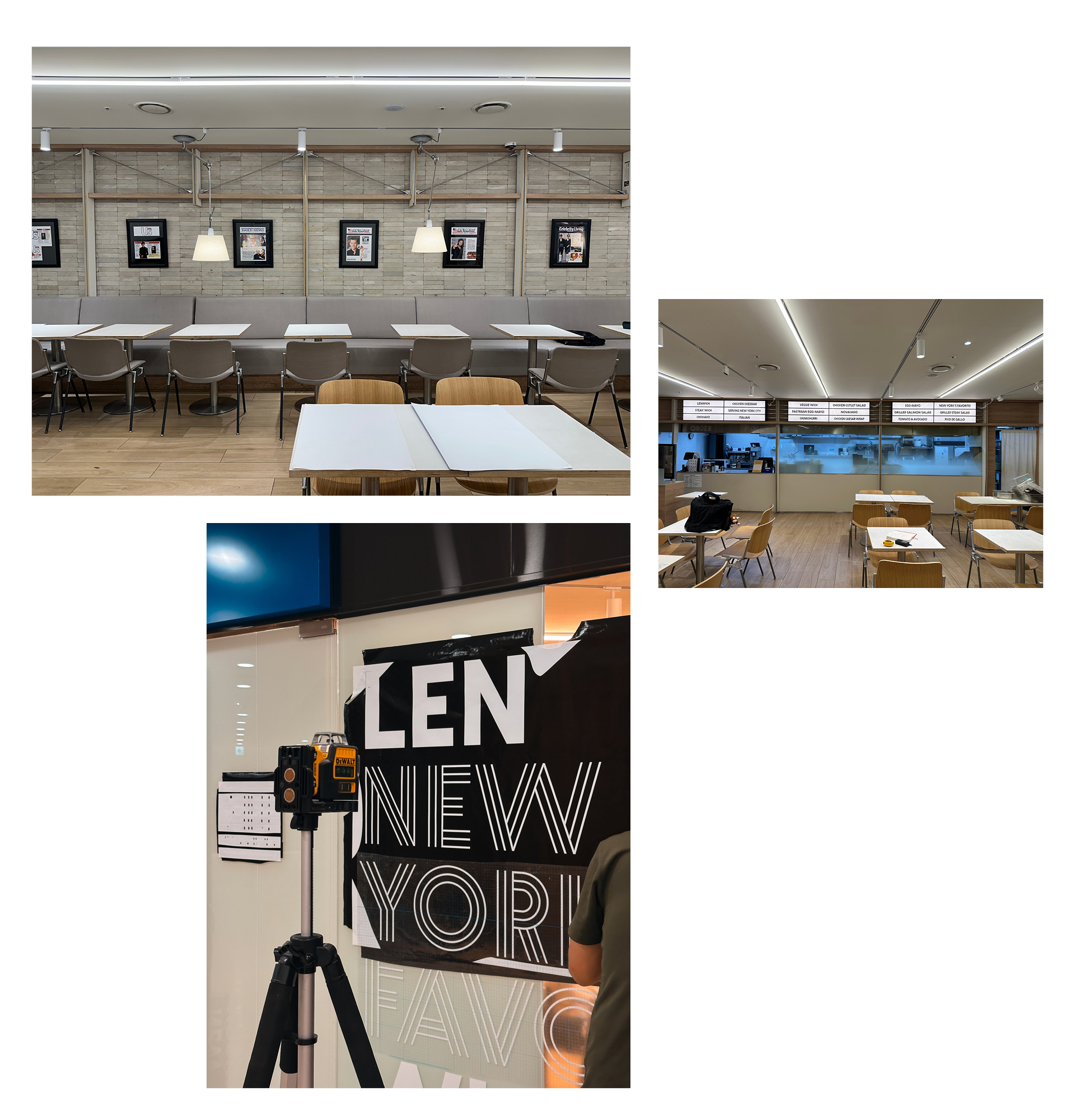
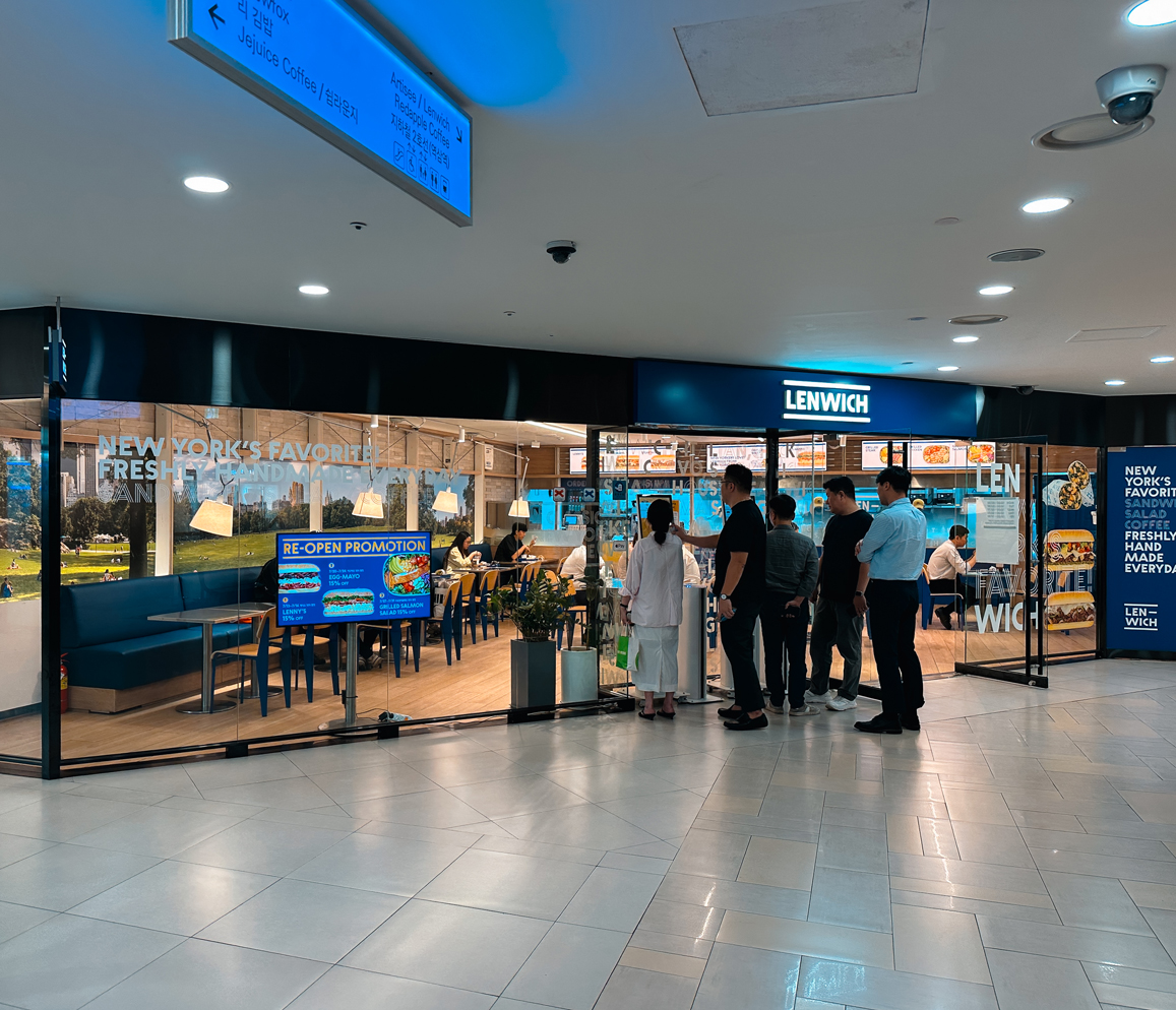
기존 매장은 샌드위치 브랜드의 밝고 캐주얼한 인상이 충분히 드러나지 않고, 지하 상업공간 특성상 외부에서 바라봤을 때 매장의 존재감과 생동감이 다소 부족한 상태였습니다. 이에 기존 공간의 구조를 크게 변경하기보다, 큼직한 이미지와 그래픽을 적극적으로 활용해, 브랜드의 인상을 보다 선명하게 만드는 방향으로 리뉴얼을 진행했습니다.
The existing store lacked the bright, casual character typically associated with a sandwich brand, while its underground location made the space feel relatively subdued and less visible from the outside. Rather than making major structural changes, the renewal focused on creating a stronger brand presence through large-scale imagery and bold graphic elements.
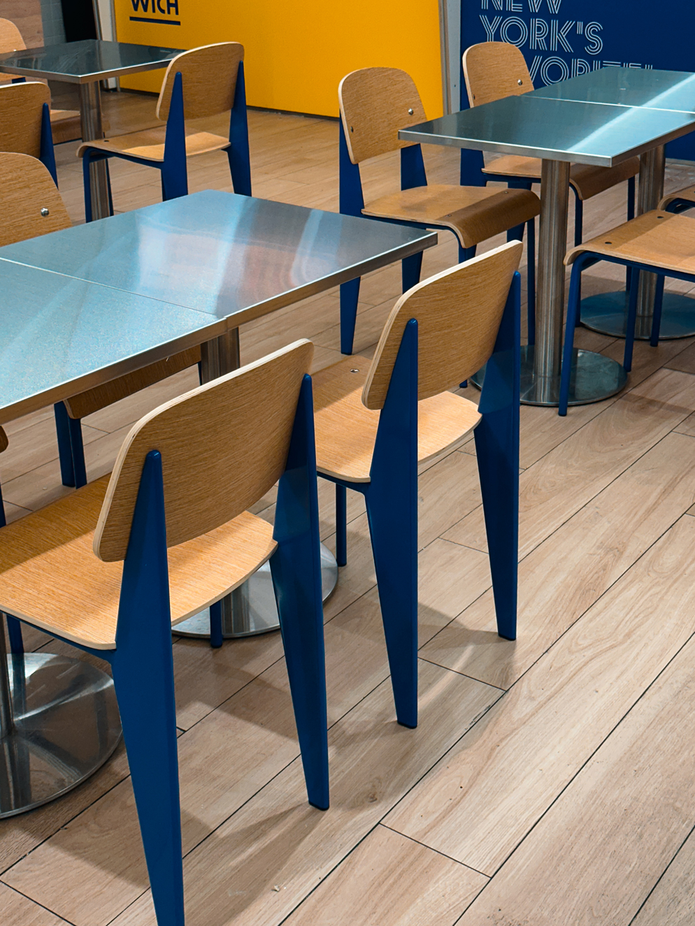
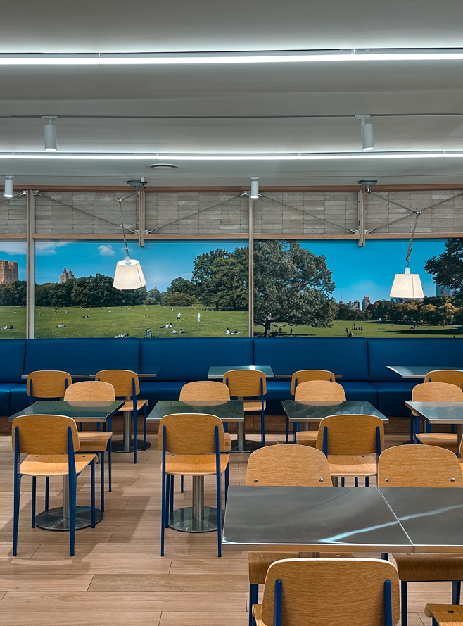
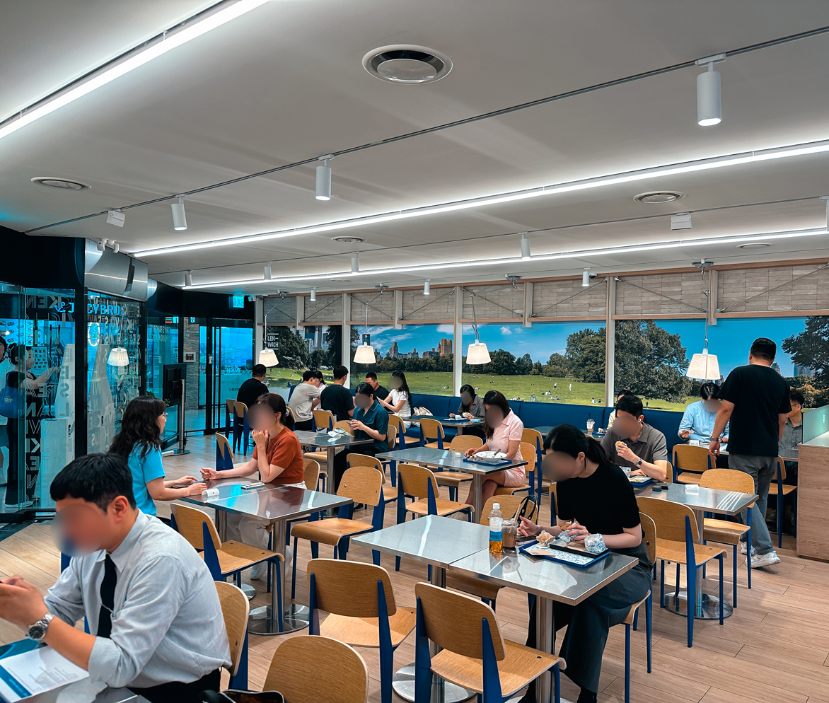
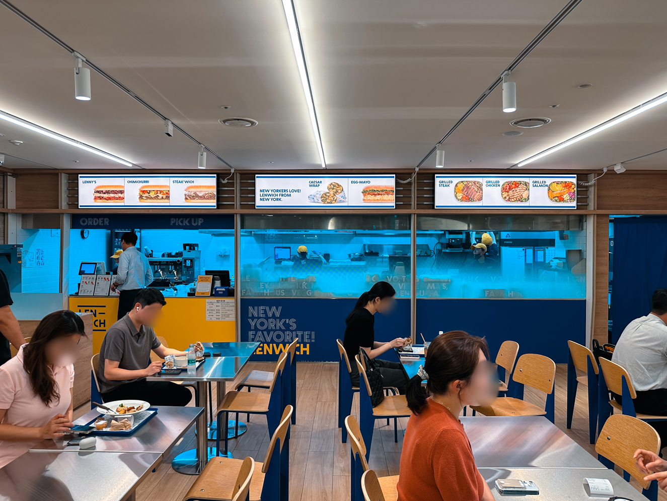
매장의 분위기를 보다 분명하게 전환하기 위해 테이블과 의자, 붙박이 좌석 등 주요 가구를 새롭게 교체하고 전체 좌석 배치도 재구성했습니다. 우드와 블루 컬러를 중심으로 한 시팅에 스테인리스 테이블을 조합해 LENWICH의 캐주얼하고 도시적인 인상을 강화했으며, 좌석 간 간격과 동선을 함께 조정해 기존보다 개방감 있고 쾌적한 공간으로 정리했습니다.
To create a more noticeable shift in the overall atmosphere, the tables, chairs, and built-in seating were replaced, while the seating layout was also reorganized. Wood and blue-toned furniture was paired with stainless-steel tables to reinforce LENWICH’s casual, urban character, while adjustments to spacing and circulation helped create a more open and comfortable dining environment.
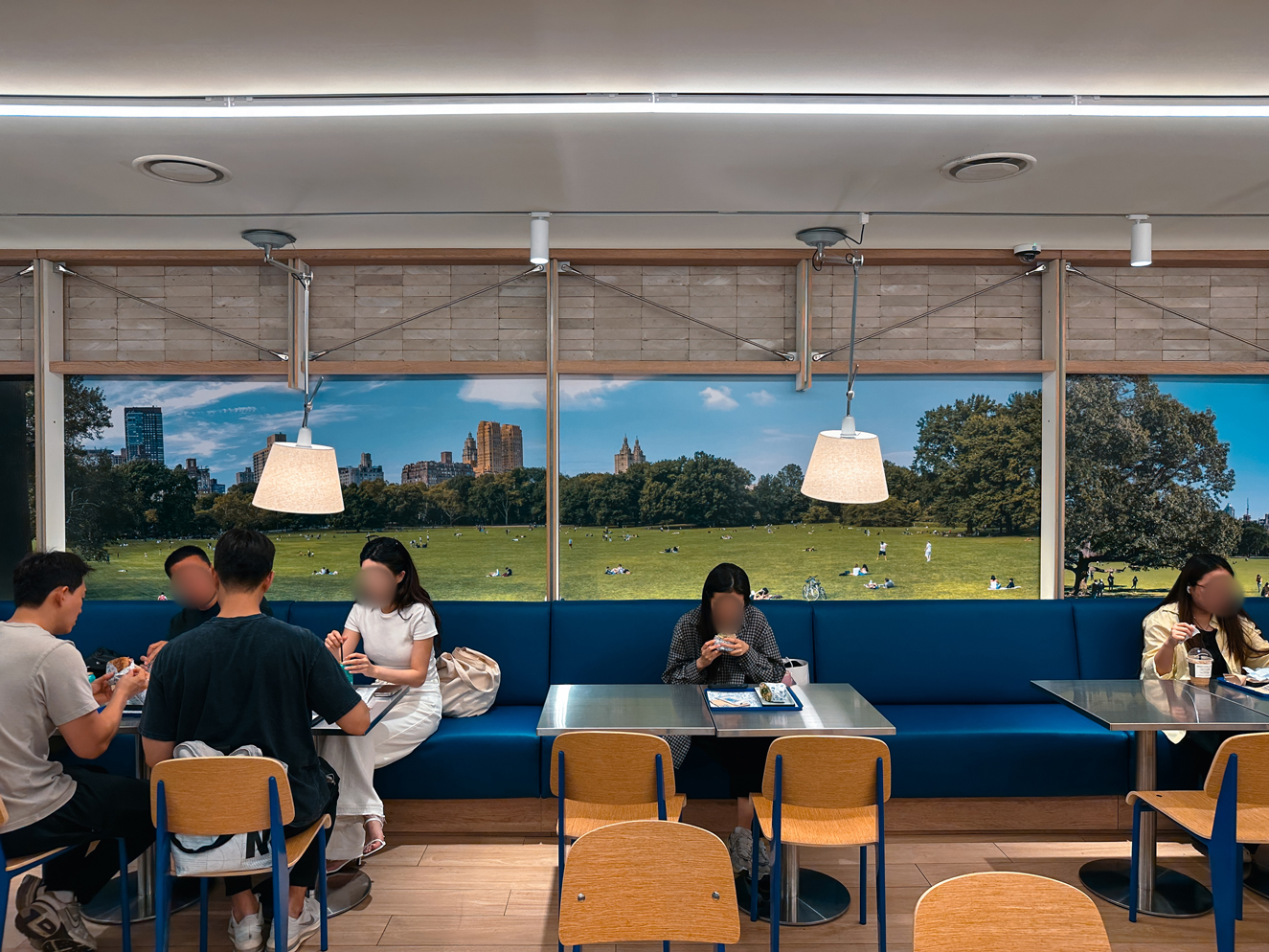
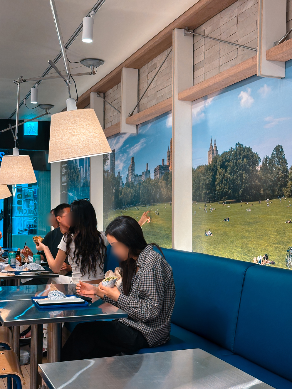
LENWICH의 핵심 메시지인 ‘NEW YORK’S FAVORITE!’에서 출발해, 매장 한쪽 벽 전체에는 뉴욕 센트럴파크의 풍경을 확장해 적용했습니다. 좌석 뒤로 길게 이어지는 공원의 풍경은 지하 공간의 답답함을 덜어내는 동시에, 매장 밖에서도 한눈에 들어오는 시각적 포인트가 됩니다.
특히 다양한 글로벌 기업이 입주해 있는 GFC의 이용객 특성을 고려해, 뉴욕이라는 지역성을 단순한 장식적 이미지가 아닌 브랜드와 이용객 사이의 친밀감을 만드는 공간적 경험으로 연결하고자 했습니다. 뉴욕을 방문했거나 생활했던 사람에게는 익숙한 장면으로, 그렇지 않은 이용객에게도 LENWICH가 가진 도시적이고 캐주얼한 분위기를 직관적으로 전달합니다.
Inspired by LENWICH’s key message, “NEW YORK’S FAVORITE!”, an entire wall was transformed with a panoramic image of New York’s Central Park. Extending across the seating area, the expansive landscape helps open up the enclosed underground environment while creating a strong visual focal point that is immediately noticeable from outside the store.
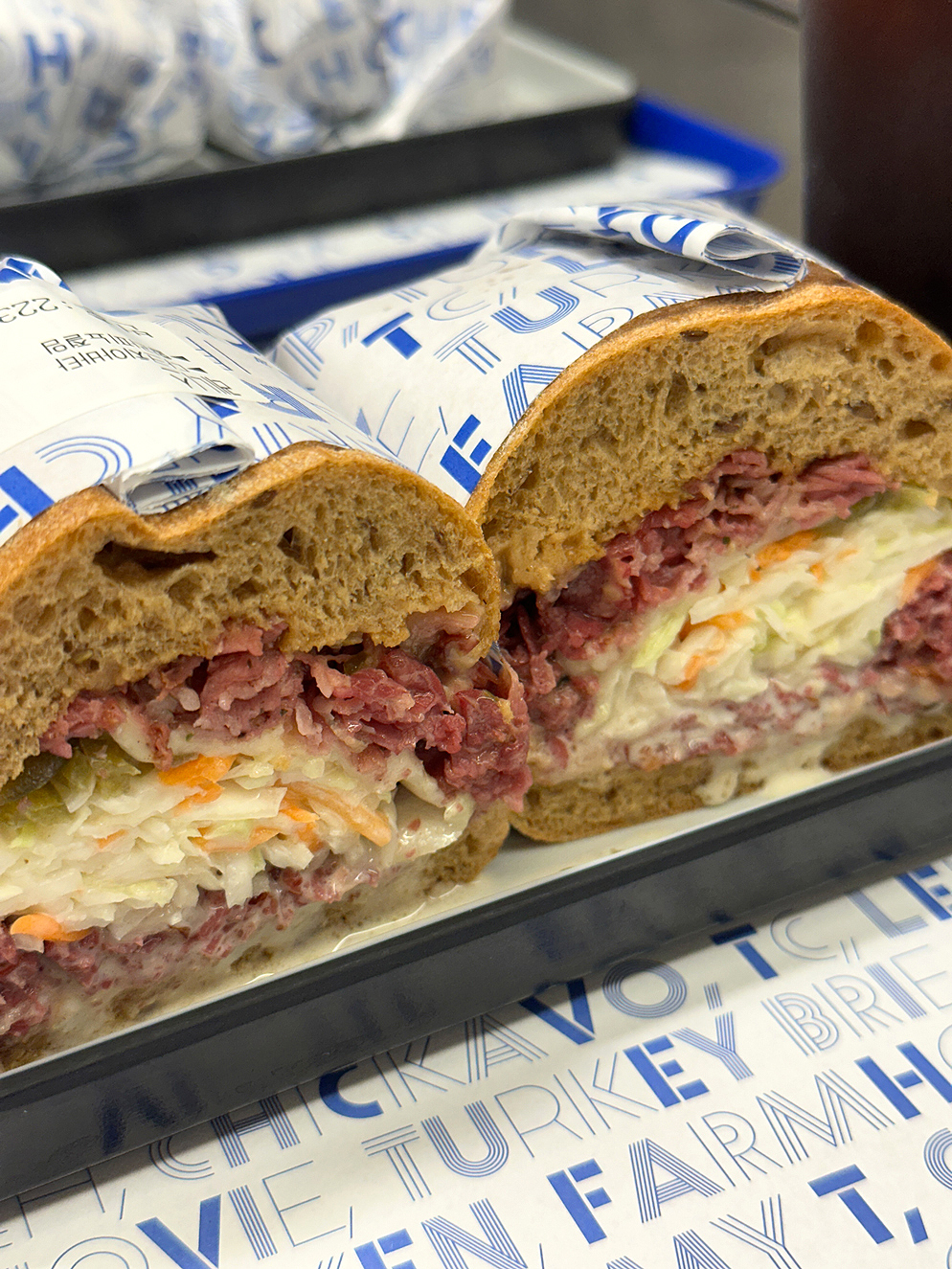
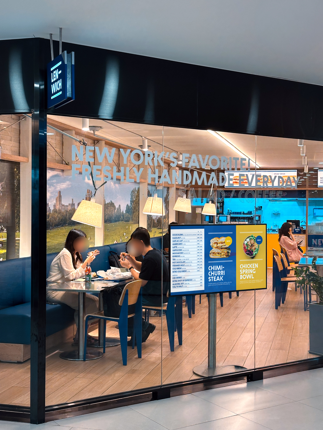
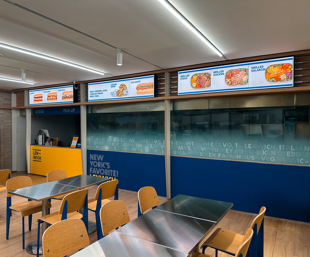
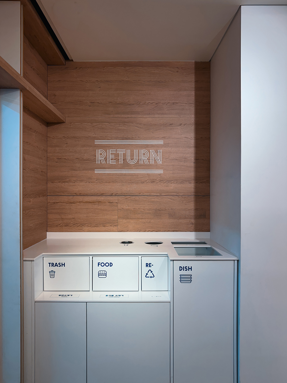
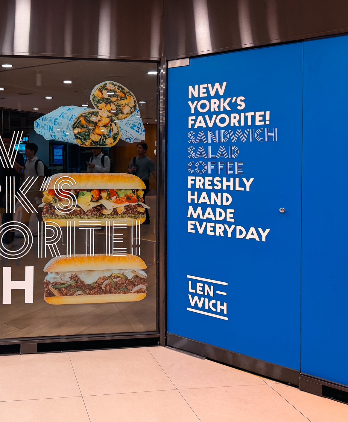
브랜드 컬러인 블루와 옐로를 중심으로 메뉴보드, 유리 그래픽, 사인 등 주요 접점도 함께 정리했습니다. 뉴욕이라는 브랜드의 배경을 공간 전체로 확장해, 매장에 들어서기 전부터 LENWICH의 분위기를 경험할 수 있도록 디자인했습니다.
The brand’s signature blue and yellow were carried across menu boards, window graphics, and signage. By extending LENWICH’s New York identity throughout the space, the renewal creates a brand experience that begins even before customers enter the store.
- 다음글네비우스 ICML 네트워킹 행사 26.08.06
댓글목록 0
등록된 댓글이 없습니다.